


A Blink-182 Inspired Cookie set | Cookies by Kate

If you grew up a fan of Blink-182, this set is for you. Between the colors, patterns, references, I basically got to turn 2000's pop-punk nostalgia into cookies and had too much fun with it.

For this set, I used two different icing consistencies and four different colors. (technically five colors if you count that little bit of ivory) I also used my edible printer to achieve the paint-splatter and checkered pattern throughout the set.
The first thing I did was sketch out the entire design in Procreate. This is totally optional, but I feel like sketching everything beforehand helps me visualize the balance of colors, shapes, and patterns before I actually start decorating.
This set had five different designs. Of course, I originally wanted to incorporate all of the Blink-182 albums, but they’re all so different in color and style that I decided to pull inspiration from a few different elements instead. I wanted the cookies to feel like Blink-182 without the set looking completely chaotic.
Design 1: The Blink-182 Logo
Obviously, I had to include the actual band name.
I went with the 2011 era Blink-182 logo because the spray-painted look fit perfectly with the rest of the set. I also knew I wanted to incorporate some paint-splatter details from the album, so this helped establish that slightly messy, punk-rock feel from the beginning.

Design 2: “What’s My Age Again?”
We all know the song.
Since these were for a millennial birthday, What’s My Age Again? felt pretty perfect. I used a spray-paint-style font for the lettering so it would tie back into the Blink-182 logo and keep everything cohesive.
And honestly, if there is ever an appropriate time to put What’s My Age Again? on a birthday cookie, this is it.

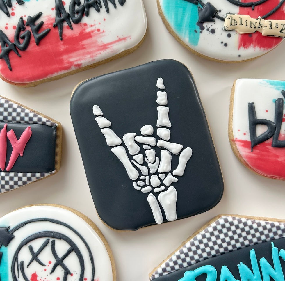
Design 3: Skull Hand
Using that same cookie shape, I felt like there was almost too much color going on in the set, (I know, sounds impossible) I wanted something that would balance out all of the bright colors, so I went in the opposite direction and made this cookie solid black with a skull hand design. It’s giving punk rock, right?
The black also gave your eyes somewhere to rest between all of the bright colors, paint splatters, and patterns in the other designs.
Design 4: Checkered Name Plaque
You can’t have punk without a checkered pattern.
For this design, I wanted to incorporate the pattern into the name plaque without letting it completely take over the cookie. Checkered patterns can get busy really quickly, so I tried to keep this one slightly subtle.
I started by outlining and flooding the top and bottom portion of the cookie, then used my edible printer for the checkered design. I filled the middle section with black, which helped break up the pattern and made the neon lettering really pop.
I also used the same spray-paint-style font from the What’s My Age Again? cookie so the designs would still feel cohesive even though each cookie was different.

Design 5: Album Cover
Every band-themed cookie set needs an album cover.
This one was definitely the most time-consuming (and my favorite) design of the five. I started by flooding the cookie completely white, then used my edible printer to print the logo directly onto the cookie. This helped make sure every cookie had the same placement and gave me a guide to follow when I went back over the design with royal icing.
Normally, I could use my projector for something like this, but because the design is circular, having it printed directly onto the cookie made my life so much easier. (I don’t know, circles are hard, man.)
The original album artwork has that imperfect, spray-painted look, so I didn’t want the royal icing to look too clean or precise. I wanted some of that messy texture to show through and stay true to the original design.
For the band name, I made the tiniest amount of ivory icing (seriously, barely any) Once everything was completely dry, I used an edible marker to carefully add the name and other fine details. It gave me much more control over those tiny lines without having to make an entirely different icing consistency for such a small part of the design.

Bringing the Set Together
Even though every cookie in this set is completely different, I repeated a few elements throughout; neon colors, black details, spray-paint textures, checkered patterns, and the same fonts, to make everything feel like one cohesive collection.
That’s also why I like sketching my sets beforehand. When you’re working with this many colors and patterns, it’s really easy for everything to start competing with each other. Planning the designs first helped me figure out where I could go bold and where I needed to pull things back.
And somehow, five completely different cookies came together into one very loud, very nostalgic, very Blink-182 birthday set.
Comments